Posts

Showing posts from 2013

Peace Sign With Wings

Image
"Peace Sign With Wings" I got a new sketchbook for Christmas. This is the first drawing I did on it. I drew it on the back cover. I drew it in pencil and then used markers to ink it and color it. The peace symbol is a great one. It has great meaning. I tried to give the picture a psychedelic background. I hope everyone has had a merry Christmas, and will have a happy New Year.
Season's Greetings, Everyone!

Image
"Merry Christmas" Happy holidays to you all!

The Drawing Board - Avery Ellis Redesign, Updated

Image
"Avery Ellis Redesign" Here's an updated on an old artwork. I digitally colored "Avery Ellis Redesign" earlier tonight. I think it turned out cool. I did another redesign after this one. I was going to digitally color it, but it didn't work considering that I scanned it from the back cover of a sketchbook, or something like that. There it is below. "Avery Ellis Redesign II"  Well, I hope everyone has a great Christmas. Happy holidays!

Snowman

Image
"Snowman" Here's a Christmas-themed artwork I did back in 2004. I used color pencils on black paper. Building a snowman is a cool thing to do at this time of year. Snowmen are a symbol of Christmas and winter. Frosty is of course the most famous snowman of all. Frosty The Snowman airs on CBS every Christmas. Frosty Returns has aired after it in previous years. But I didn't see it air this year. At least not yet. Snowmen are very cool. Merry Christmas, and happy holidays!

The Future Of The Drawing Board

Image
"The Drawing Board - Merry Christmas" I'm still thinking about doing more Drawing Board comic strips. I want to come up with some really funny strips. I Like the characters I've created, and I want to do more with them. So, we'll see what happens. In the meantime, merry Christmas, and happy holidays!

Merry Christmas

Image
"Merry Christmas" Here's a Christmas-themed artwork I made last year. I thought it would make for a good blog post. I hope everyone has a great Christmas. Merry Christmas!

Gloomy

Image
"Gloomy"  This isn't very upbeat for the holidays, but I thought I'd post it. I think the shading turned out really well. And the halftone background looks good. I'm thinking of seeing if I have some Christmas art I haven't blogged before. I might do some new Christmas art as well. So, my next art blog posts may be more cheerful.

Happy Thanksgiving 2013!

Image
"Guy in Sunglasses" I thought I'd do a quick post of an old artwork, and wish everybody a happy Thanksgiving. Happy Thanksgiving!

Toony Ghost Rider

Image
"Toony Ghost Rider" Here's a Ghost Rider artwork, cartoon style. I'm especially proud of how the flames turned out. I think I used a similar technique for the flames before, on an artwork I did titled "The Man with the Burning Brain."

Smiley/Frowny

Image
"Smiley/Frowny" I drew this in pencil and color pencil. I thought about drawing them separately. I thought about doing an artwork of the frowny face, and then a separate one of the smiley face. But I didn't want to wait to draw the smiley face. So, I drew both in one picture.

Freaking Out

Image
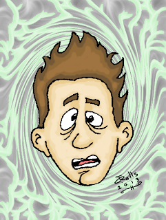
"Freaking Out" I drew the face awhile back. I scanned it, digitally colored it, and photo shopped the background in, more recently. I think the background actually works out really well because it looks like clouds that swirl as the get closer in around his head. It helps with the mood I was trying to convey with this artwork. I think this artwork came together really well.

Monty Python's Gumby

Image
"Monty Python's Gumby" Here's a picture I drew of Gumby, played by Michael Palin on Monty Python's Flying Circus . I actually drew this awhile back. I wasn't sure about how I drew him because I think one of Terry Gilliam's illustrations of him shows him as a big, bulky brute. But, I think every artist has their own interpretation of him. I've seen some on deviantART. I thought it would be cool to put a line from the show on there, so I did. I think this artwork turned out really cool.

Lawyer

Image
"Lawyer" This drawing is sort of based on Sam Waterston of Law & Order . Sam Waterston actually had more gray hair on top than he did on his temples. This is one of the drawings I did in my little The Dark Knight Rises sketchbook.

Nosferatu

Image
"Nosferatu" I drew this earlier. It's sort of based on the main character of the movie Nosferatu . I had the idea of doing a character with a bald head and pointy ears, and I went from there. I thought about drawing an alien, but I ended up drawing a Nosferatu-style vampire. The Vampire in Nosferatu has his fangs on his upper jaw, but I decided to draw this vampire's fangs on his lower jaw. At least they're the fangs you can see.

Casey Abrams Vs. Ice Cream Cone in Basketball

Image
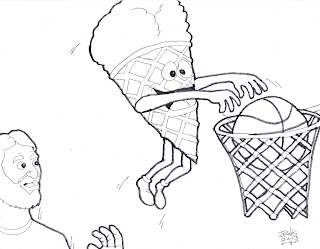
"Casey Abrams Vs. Ice Cream Cone in Basketball" I haven't posted in awhile, and I thought this would be a good opportunity for a blog post. My sister made me aware of a contest from musician and former American Idol contestant, Casey Abrams, on Facebook. The contest is to draw an ice cream cone beating Casey in a sport of your choice, and you have three hours to complete it. I'm not sure if he means three hours from the time he posted the post, or if you have three hours once you start. I'd thought about doing a drawing of them playing chess, but I don't know much about chess. I ended up going for basketball. I was going to do a farther away shot from the side, but I decided to give it a better view, and this is what I came up with. I think it looks pretty cool. My sister said that Casey does contests like this often, and that he posts the drawings to his Facebook page. I don't know how long the contest is open, but the post for it is on Casey Abrams&

Christopher Hart has a New Drawing Contest!

Christopher Hart has a new drawing contest, and their are 10 prizes to win! You can check out his blog post about it for details, here . There will be five winner each will win two prizes! It looks like an awesome contest.

The Seventh Doctor

Image
"The Seventh Doctor" I thought it would be cool to do a cartoon-style drawing of The Seventh Doctor. I watched The Doctors Revisited - Seventh Doctor on BBC America at the end of last month, July 27. They showed "Remembrance of the Daleks" in that special. I loved it. Sylvester McCoy was a great Doctor. Also, Dorothy Gale McShane's Ace was a really cool companion for him. It was great to see them battling the Daleks. The Daleks are like The Joker to The Doctor's Batman, except there are more of them than there are of The Joker. The Doctors Revisited - Seventh Doctor made for a great Saturday night. The Seventh Doctor is awesome!

Draw

Image
"Draw" I got some new drawing pads some time ago this year, and this is the first drawing I've done from one of them. I think I was actually thinking about how I needed to draw more when I drew this. That's why I drew the word "draw," several times. Those drawing pads are cool. That particular one had a certain texture to it. I think it worked out well.

Christopher Hart's Assignment #3, on deviantART

Image
"Worried Face" Here's my submission for Christopher Hart's "Assignment #3." For this assignment, he showed us a confident-looking character he drew. He wanted us to draw the character with a worried expression. This is what I came up with. I drew the basic look of the character, but I drew him more in my style. I wanted it to be clear that I was drawing that character as the assignment says to, but try to avoid making it look too much like Christopher Hart's style. I usually draw a more pronounced jaw line, but I kept the original jaw line for this character, as I did with the head shape in the submission I titled "Goofy Face." I figured his eyebrows would be tilted. I thought to add more intensity to it, I'd express his worry through his mouth as well, and I added some sweat to his temple. I think this drawing turned out pretty well. You can see Christopher Hart's journal post, on deviantART, about the assignment here .

Christopher Hart's Assignment Number 2, on deviantART

Image
"Goofy Face" I just submitted my work for an art assignment from Christopher Hart. You can see the work above. The assignment is at on deviantART, here . Basically, he showed a cartoon face he drew, and he said to redraw it. He told us to make up our own features and expression. I drew a goofy-looking guy with crossed eyes and buck teeth, and kind of a funny hairdo. It's a little like Ed Grimley's slicked up point on the front of his hair. I drew it in more of my own style. This is the second assignment from Christopher Hart, and I think he's doing more of these. I think it's a cool idea.

Hump Day

Previously I mentioned an artwork I did over the weekend, which is a Batman drawing. I was working on the shading. I'm not sure I'm satisfied with it, so I don't know if I want to blog it. That's why I usually don't blog about artworks ahead of time. I might decided I'm not satisfied with the result, and whoever read the blog post, and was interested in seeing the artwork, might not get to see it. I might show it as an outtake at some point, if that. Maybe. Or, I might redraw it and post that. I'll see what happens. If you haven't checked out Darrel Tank's site, FivePencilMethod.com , I highly recommend it. He has some great techniques for doing amazing drawings. I've been visiting the site and watching the videos, and he really knows his stuff. He's a pro. I just checked out a cool-looking book from the library. It's titled How to Draw Chiller Monsters, Werewolves, Vampires and Zombies , by J. David Spurlock. I'll be reading tha

Draw, Draw, Draw!

I haven't done a lot of drawing lately, which is why I haven't posted much. I intend to get back into drawing big time. I've read that you should draw everyday to keep your skills sharp. So, that's what I plan to do. I haven't been working on the "Ginger" artwork frequently lately, but I think I've more or less got a huge portion of it done. I did a Batman drawing last night and I think it turned out really well so far. My skills are still pretty sharp. I did try to do a couple drawings before it that didn't turn out the way I'd hoped, but this one I think is going good. I'm not finished with it yet, so I won't be posting it in this blog entry. I've got to work on the shading. In the meantime, here's a journal entry I posted on my deviantART page. It's about a fellow deviant on there named KyaValentine. I recommend checking out her page. She's got some cool stuff on there.

New Look for My Blog

I just changed the look for my blog. I decided I wanted something different. I don't think I want to change the look too often because I think a familiar look helps make my blog more recognizable. My blog has gone through many different designs. I like to think of it as sort of like the TARDIS interior on Doctor Who . It changes occasionally. I think this newest design looks cool, and I might stick with it for awhile.

Happy Fourth of July!

Image
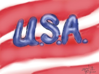
"USA" I decided to put my blog on hiatus this week. I haven't had anything to post. However, I figured I ought to post something for the Fourth of July. Above is one of my artworks for Terribly's 30 DAY DRAWING/ART CHALLENGE on deviantART. This is the first time I've blogged it. I got busy with other things before I finished the challenge, so there are some artworks I didn't blog. I hope everyone has a great, and safe, Fourth, even if you're not in or from this country. Happy Fourth of July! (Terribly. FYI, this is the citation, not part of that sentence.) Works Cited Terri. 30 Day Art Challenge . Terri. http://terribly.deviantart.com/art/30-DAY-ART-CHALLENGE-330788048

Ginger - Progress

I think my oil pastel artwork of Ginger is looking great. I've got a large portion of the artwork done, that is unless I find more I need to do with those areas. I've thought about posting progress pictures for it on here, but I wasn't sure about it. I did take one progress picture so far. Terry Dodson shows progress pictures on his blog. He shows all of them and the final product in one post. I might do that. But, in any case, I like how my Ginger artwork is looking.

Five Years on deviantART

Image
"My (First) deviantID" This is my fifth year on deviantART. I've upload lots and lots of artworks on there. deviantART is like Facebook in someways. You can connect to other artists on there. I've got a bunch of artists on my deviantWATCH, which is like a friend list. I've got various artists on there, some like J. Scott Campbell for example. deviantART is a great place to show your artwork, and see artwork from other artists. deviantART has been up for quite awhile. I first joined in 2008, and my first "deviation," which is a name for artworks submitted on there, was "Tru Faith." You can see that artwork below. "Tru Faith" You can use folders on there to put your deviations in. It's great if you want to highlight certain drawings or put your artworks into categories. I have several folders in my gallery. I also have what's called a "scrapbook." Your scrapbook features artwork that doesn't show up in th

Buggle

Image
"Buggle" This is based on Trevor Horn of the Buggles. The Buggles had the first music video to ever air on MTV. The video was for the song titled "Video Killed the Radio Star." I decided to draw it as a cartoon drawing. I think Trevor Horn's look back then works well in a cartoon style, and I mean that in a good way. He had a very memorable style that really stood out.

Wednesday Workings

 It seems like I just blogged a post yesterday, and here I am doing another one. I'm not complaining though. I've got some artworks I'm working on, mainly my Ginger artwork. I've worked some more on the Ginger artwork. It looks like it's coming along pretty well. I hope to make it a great representation of our cute little Yorkie puppy. The photo it's based on is an early one of Ginger. She looks very different now from how she did then. Part of why I chose the particular picture was that it has bright colors in it. I seem to remember reading about how Vincent Van Gogh liked to work with bright colors. I also thought it was a cute, peaceful picture of Ginger. She looks like she's sleeping in it. deviantART has updated the journal feature on their site. The journal feature has new features that it didn't have before. You can use bold, italic, etc. It seems like it's closer to how blogs work on Blogger. I'm looking forward to future use of the t

Ginger - Oil Pastels

I worked on the oil pastel stage of the "Ginger" artwork this past weekend. I may want to go back and make the parts I did more solid. This is what I consider a major project that I'm going to take quite a bit of time on. I'd like to do some smaller works on the side while I'm at it. I haven't got anything in mind at the moment, but I think it would be cool to have some drawings to post this week. I think I most commonly do smaller works that I can blog on here. I do want to do more major projects to though. As for the "Ginger" artwork, I think it's going very well.

TGIF!

I don't have any artwork that I'm sure I want to post this evening. But, I do have a progress report on my Ginger artwork. As I blogged previously , I finally started it last Saturday. I think I've got the drawing part done, more or less. I may start on the oil pastels soon. Everybody have a happy Father's Day!

And Now for Something Completely Different

Image
 "And Now for Something Completely Different" I've been getting into Monty Python quite a bit lately. I read The First 20 Years of Monty Python . I watched Monty Python's the Meaning of Life . I've been looking up trailers for the movies and things like that. I drew this, this week. I was going to call it "Monty Python Sketch Dump," but I didn't like the sound of it. I particularly didn't like the word "dump." It makes it sound like the drawing isn't good for anything but trash. A sketch dump is like various drawings on one page that you'll never use for anything. I felt like drawing Monty Python, so I started by drawing John Cleese doing the silly walk. Then I think it was "IT'S" that I drew next, then the caption saying "AND NOW FOR SOMETHING COMPLETELY DIFFERENT." Then I drew the hand, and lastly the clouds. I basically did various Monty Python doodles on one sheet of paper. This was my last

Ginger - The Beginning

I finally got started on my Ginger artwork last night. I delayed it for awhile because 1) I wanted to make sure I was in the mode to do it and, 2) I was trying to decide on whether to use the grid method, and how to do it. I ended up passing on the grid method because it looked like it would be a complicated process for the size of the photo and the drawing. I think I'm very good at drawing completely freehand though, so I figured I could probably manage without the grid. I was concerned about how much the artwork should look like the photo, down to the smallest detail. I decided it doesn't necessarily have to look identical. Not drawing it identical to the photo in fact makes it more my drawing. Artists can try to make their artworks identical to the subject if they want, but I think doing it a little different has its benefits. If you take some liberties with it, it has a style that's yours. You can draw the hairs in more or less different positions, or what

Jessica Alba's Smile

Image
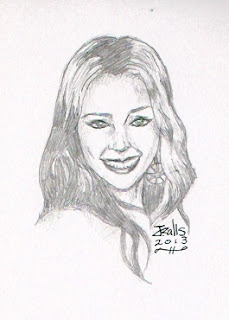
"Jessica Alba's Smile"   This is a picture of Jessica Alba that I drew in my sketchbook earlier. She's got a nice smile. Everybody have a great weekend!

The Drawing Board Redesigns

Image
Various drawings for The Drawing Board redesigns I drew these drawings back when I was redesigning the characters for my comic strip titled The Drawing Board . The characters on there are Avery Ellis (with the goatee), Violet, and myself. Then there are, of course, the titles. I always put the title at the top of each comic strip previously. I used Impact font. For the post-redesign strips, I'm thinking of using something like Comic Sans. Coming up with story ideas for the series, post-redesign, is challenging. I'm trying to come up with some really funny stuff. Yesterday, I started reading The First 20 Years of Monty Python , by Kim "Howard" Johnson. I'm hoping that book gives me some inspiration for my comic strip. I'll see how that goes. All in all, I hope to outdo myself with the series, post-redesign.

Neal Adams' Blog

Image
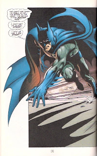
An iconic Neal Adams image from Batman #251 One of the blogs in my links is for the legendary comic book artist, Neal Adams. One of the first artworks, maybe the first, of his that I remember is a version of the above artwork. I don't know if it was actually drawn  by him, but it was based on said image above. In 1989, Tim Burton's first Batman movie was in theaters. My family and I went to Taco Bell, or Del Taco, one day. One of us got a cup with our meal that was illustrated to promote the movie. It has the Batmobile and its specs on it. It also had an image that basically looked like the one above, but with the suit that Michael Keaton wore in the movie. Over the years, I saw more of Neal Adams' art and discovered who he was. Now, as with undoubtedly a lot of other people, to me Neal Adams is synonymous with Batman. He has become one of my favorite artists. You can check out his blog, The Neal Adams Blog , at http://nealadamsblog.blogspot.com/ (Adams). Works

The 11th Doctor's Goodbye

It was announced today, by BBC, that Matt Smith will be leaving Doctor Who after the 2013 Christmas special. This is sad news to me and all the 11th Doctor fans, and possibly even fans of The Doctor in general. Minutes ago, I posted a journal entry about it on my deviantART page. You can check out that journal entry here .

Jeff

Image
"Jeff" My sister bought me some new art pads this week, and this is my first artwork from one of those. They're Royal & Langnickel Essentials artist pads. Each one that my sister got me has a different type of paper for different media. The one that I used for this artwork is a drawing pad. I started out drawing this with a mechanical pencil. I didn't think it was dark enough so, another night I used some art pencils. I think the first one I used was 6B. The last one I used was 8B. 6B was darker, but I thought I needed to also use 8B to give it more depth. I'll undoubtedly have more artworks to post from those art pads. On a different note, I thought I'd close out this post by mentioning that I have a new section in the menu below my banner. It's a portfolio section. I have a few artworks on that page, and I'll have more as I do ones that I find suitable to that page.

My Third Logo, Psychadelic Version

Image
"My Third Logo, Psychedelic Version" I designed this yesterday as a new deviantID, for my deviantART profile. I used JASC Paintshop Pro. I basically used a halftone effect, from the Artistic Effects section, on my logo. Next, I added a frame from the frame feature. I've used a few different logos for my deviantID over time. This is my latest deviantID logo. It really stands out on my deviantART page.

"Desert, Santa, Tumbleweed."

Image
"Killer Tumbleweed" My family and I have a tradition of watching Christmas movies every December. One of the movies we watch is I'll be Home for Christmas , starring Jonathan Taylor Thomas and Jessica Biel. There's a line in the movie about Jonathan's character being attacked by a killer tumbleweed. I thought it would make for an interesting sketch if I took it further. Here, it actually is a killer tumbleweed, a living one. It's sort of like Attack of the Killer Tomatoes . I wanted to keep it simple, so I drew it in a cartoony style. We'll most likely be watching I'll be Home for Christmas this December, as we do every December. It's a cool movie ( I'll be Home for Christmas ). Works Cited I'll be Home for Christmas . Dir. Arlene Sanford. Perf. Jonathan Taylor Thomas and Jessica Biel. Walt Disney Pictures. 1998. Film.

Projects

I've got some projects going. I worked on one project for my grandma. Next, I'm going to be working on something for my sister. I also hope to start on the oil pastel artwork of Ginger, mine and my family's Yorkie puppy. I was going to start on it earlier, but I've been making preparations before I actually start on it. I'm thinking of using the grid method for it. I have to get the grid sized up right on the paper and the photo that I'm basing the artwork on. The grid method basically makes it easier to draw something. It makes it less overwhelming because it makes you focus on a section of the picture at a time. So, I'm going to be keeping busy with my art.

More of My Artworks in Lowrider Arte

Image
Lowrider Arte , February/March 2012 issue My artworks published in Lowrider Arte I got two artworks posted in Lowrider Arte 's February/March 2012 issue. I actually missed that issue last year, so I didn't know until this week that they'd published my artworks in that issue. My sister ordered the back issue of it for me, which is what the scans are from. I didn't realize, at the time that I blogged the previous blog entry , that both artworks were in there. As I mentioned in said blog post, I'd gotten an artwork published in Lowrider Arte back in 2005. So, the

Caricature of Matt Smith as The Doctor

Image
"Caricature of Matt Smith as The Doctor" I drew this last night. I didn't do a lot of shading. I figured it would be best to save it in case I digitally color it. In some cases, if you shade in the inking stage, there's a risk of making the person look like they have a black eye or dirt on their face. I've done quite a few Doctor Who drawings since I've become a Whovian. This is my latest.

Eliza Dushku IV in Lowerider Arte

Image
"Eliza Dushku IV" Last year I got a second artwork published in Lowrider Arte magazine. "Eliza Dushku IV" was published in the February/March 2012 issue. You can check it out on the Lowrider Arte site here . This is my second artwork to be published in Lowrider Arte . The first was "Vanessa Minnillo," which you can see below. "Vanessa Minnillo" Coincidentally, "Vanessa Minnillo" was also published in a February/March issue, in 2005. I'm proud that I can now say that I've had two artworks published in Lowrider Arte . This is also my second artwork to be published in a national publication.

Cool Freddy

Image
"Cool Freddy" This is a cartoon drawing of my teddy bear from my childhood, Freddy. This is one of the drawings I've done this week.

Ashley Rickards

Image
"Ashley Rickards" This is a drawing I did earlier tonight of Ashley Rickards, from the TV show Awkward . I don't watch Awkward, but I saw an article about it in Entertainment Weekly , and I decided to draw Ashley Rickards. I was going to ink it, but I decided to leave it as is. I've done a lot of drawings lately where I inked them before I scanned and posted them, so I decided to skip the inking stage with this one.

Violet 2

Image
"Violet 2" Here's a follow-up to yesterday's blog post . It's more Violet, from my comic strip titled The Drawing Board . This is sort of like album art, if Violet made an album of music. The only thing is, if it were a CD cover, it would have to be more square. Besides being a follow-up to yesterday's post, it's also titled as a sequel to the first character design, which you can see in said post.

Violet Redesign

Image
"Violet Redesign" This is my redesign of Violet, from my comic strip titled The Drawing Board . I drew her in a similar pose to the one I drew her in in the original character design, which you can see below: She has a narrower head, with a sharper jaw line, in the original one. I decided to try a different look for her head in the new design. The body is basically the same, but more simplified. So, basically this new design is very similar to the old one in some ways, and different in other ways. This new design keeps very much of the older character design, with some modifications.

Musical Companion

Image
"Musical Companion" Music is inspirational, and it puts you in a mood. I think what mood might depend on what music you're listening to. I like to listen to music on my iPod Nano while I'm making art. I listen to a lot of '80s music, blues, hard rock, etc. I've been listening to some of the same songs every time, and then some different ones. I've been frequently listening to some songs such as "Some Guys Have All the Luck" by Robert Palmer and "Hot in the City" by Billy Idol. Music can help along the creative process for an artist. Music is great!

Art Project and Iron Man 3

I don't have much to blog about in this post as far as art. I'm going to get started on an oil pastel artwork of our Yorkie puppy, Ginger, soon. My dad and I saw Iron Man 3 tonight. I posted a review of it at my Tumblr blog, here . It's an awesome movie!!!

Bearded Guy Sketch

Image
"Bearded Guy" Deep South Paranormal was on on Syfy tonight. I had it on, and I drew this in my sketchbook. This is loosely based on one of the paranormal investigators on that show. I don't know for sure that ghosts exist, but I believe it's a possibility. Ghost Hunters is back on in new episodes this June on Syfy. It seems like a long time since it was last on. Deep South Paranormal is the newest paranormal investigation show on Syfy.

Jack with 3D Glasses

Image
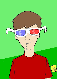
"Jack with 3D Glasses" This is a picture I drew last night. It's Jack Miller, from my comic strip titled The Drawing Board , with 3D glasses on. I'd give it a 3D effect if I had the tool to in photo shop. I'm still experimenting on my characters with the techniques I learned from Christopher Hart's Modern Cartooning . I made Jack's neck longer here. I drew his ears further up than in the redesign, but I may stick with the ears further down when I actually start doing new strips. I haven't gotten around to writing  new strips because I've been busy with other things. However, I'd like to get a start on them soon. I still need to consider whether I'm going to stick with the redesign for Matt Kirby (which I haven't blogged yet), or do another version. As for this drawing, I think it turned out pretty well.

Jennifer

Image
"Jennifer" This is Jennifer Kyle, from my comic strip titled The Drawing Board . I drew this earlier tonight. This was kind of a spontaneous drawing. I came up with the idea as I went along. The flowers took quite a bit of time. I listened to some music while I drew it, as I often do with my art. It was a very enjoyable artwork to work on.

Doctor Who

Image
"Doctor Who" This is the Doctor Who drawing I've been working on since last year. I just finished it tonight. I think it turned out pretty well. It's a drawing of the 12 incarnations of The Doctor, and his TARDIS (Time And Relative Dimensions In Space), which is disguised as a 1960's police box.  It's a fitting night to have finished it too. A new episode of Doctor Who was on on BBC America earlier tonight. It was titled "The Crimson Horror." I think it may have been one of the more bizarre episodes, and I mean that in a good way. Diana Rigg and her daughter were in it. So far, the second half of series seven has been very different from the first half, but very cool. I've become much more interested in the classic era of Doctor Who than I was before. At first, I was pretty much just focused on the revival era. However, I've been watching The Doctors Revisited specials each month this year, and I'm finding that the classic

Doctor Who Drawing

I'm nearly finished with my Doctor Who drawing. I've just got two more Doctors and a TARDIS to draw, in the drawing. I'm keeping it pretty simple. I'm using pencil, a Sharpie pen, and a Sharpie fine point marker. I sketch out one Doctor at a time in pencil, and then ink him. Later, of course, I'll be sketching and then inking a version of the TARDIS. I'm just about finished with it. Once I am, I'll post it on here.

Chibi Batman

Image
"Chibi Batman" Here's a chibi-style drawing I drew of Batman. I figured it would be a kind of simple, fun drawing to do. Batman is a great character. The chibi concept is kind of interesting to me. I might do more of them. Here's a "Chibi Superman" I drew as well.

Jack Reacher

Image
"Jack Reacher" This is what I imagine Jack Reacher, of Lee Child's novels, might look like. I drew this in a sort of cartoony style in my mini The Dark Knight Rises sketchbook. My dad said he imagines the Jack Reacher in the novels might look like Dolph Lundgren, and I think I got a bit of Dolph Lundgren in this drawing. I could see Jack Reacher looking something like this.

Ernest Gets Drawn, or "Hey, Vern, I'm a Drawing!"

Image
"Ernest Gets Drawn" I haven't done many Ernest drawings. I don't know why. My family and I love Ernest. I drew this from an Ernest mask. I drew it in pencil, then inked it. My family and I watch Ernest Saves Christmas every December. Jim Varney is well known for playing Ernest. That's not the only role he's famous for though. He also starred on Roseanne , he's played Jed Clampett in the movie Beverly Hillbillies (based on the TV show of the same name, he voiced Slinky Dog in the first two Toy Story movies. Ernest did however play a big part in his road to stardom. Ernest is a great character who was played by a great actor.

Peaceful Alien Sketch

Image
"Peaceful Alien Sketch" I was recently trying to come up with an idea for an artwork. I started doodling, and I drew this. I was trying to come up with an artwork that promotes peace. I had a few ideas for a peace artwork. All of them feature the peace sign. I though this might be a cool idea for a peace artwork. I might consider doing a more elaborate drawing of this at some point.