Posts

Showing posts from April, 2013

Jack Reacher

Image
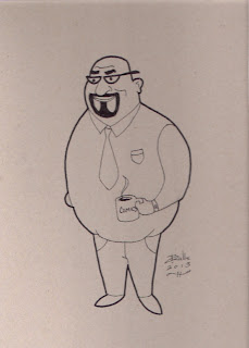
"Jack Reacher" This is what I imagine Jack Reacher, of Lee Child's novels, might look like. I drew this in a sort of cartoony style in my mini The Dark Knight Rises sketchbook. My dad said he imagines the Jack Reacher in the novels might look like Dolph Lundgren, and I think I got a bit of Dolph Lundgren in this drawing. I could see Jack Reacher looking something like this.

Ernest Gets Drawn, or "Hey, Vern, I'm a Drawing!"

Image
"Ernest Gets Drawn" I haven't done many Ernest drawings. I don't know why. My family and I love Ernest. I drew this from an Ernest mask. I drew it in pencil, then inked it. My family and I watch Ernest Saves Christmas every December. Jim Varney is well known for playing Ernest. That's not the only role he's famous for though. He also starred on Roseanne , he's played Jed Clampett in the movie Beverly Hillbillies (based on the TV show of the same name, he voiced Slinky Dog in the first two Toy Story movies. Ernest did however play a big part in his road to stardom. Ernest is a great character who was played by a great actor.

Peaceful Alien Sketch

Image
"Peaceful Alien Sketch" I was recently trying to come up with an idea for an artwork. I started doodling, and I drew this. I was trying to come up with an artwork that promotes peace. I had a few ideas for a peace artwork. All of them feature the peace sign. I though this might be a cool idea for a peace artwork. I might consider doing a more elaborate drawing of this at some point.

Hand Study II

Image
"Hand Study II" Last night, I listened to some music and did some drawing. This is one of the drawings I did. It's another drawing of my hand. I feel like the hand is one of the more challenging things to draw. As you can tell by looking at your hand, the fingers are each different lengths. They each have two joints, four if you count the knuckles. The thumb is an exception. It has one joint, or two if you count the knuckle. The hand has kind of a sophisticated shape, so you want to make sure it looks just right. The hand is one of the subjects I especially like to practice drawing.

The Drawing Board Redesigns - Avery Ellis Redesign II

Image
"Avery Ellis Redesign II" This is an alternate redesign for Avery Ellis of my comic strip titled The Drawing Board . I was listening to some music and drawing tonight. I redrew Jennifer Kyle and then Avery. With Jennifer, I just drew her torso shorter. With Avery, I decided to try a different body type. I think I like this one better than the previous one. I'm not sure if I'll consider it the final one though. I finished using the paper in the drawing pad with the Jennifer drawing, so I decided to use the inside back cover for Avery. I like to draw on the back covers of my sketchbooks and drawing pads. I've thought of another possible body type for Avery as I've been writing this. So, there may be another version of the Avery Ellis redesign to come.

Thoughts About My Art

I was just looking at a previous blog post before posting this one. It reminded me that I think Jennifer Kyle's lower legs are too thin in the redesign. I'll want to tweak them. I want to possibly start writing Drawing Board strips in place of what I've written, or for another month. I've got the paper for my artwork of Ginger. It's builder's paper, 24 inches by 104 inches. It's a roll. I think the next step is to cut out the right size sheet for the artwork. Then, I'll draw the picture before starting to use the oil pastels. After reading about Vincent Van Gogh, I decided to choose a picture with bright colors for the artwork. It's kind of a collaboration because my dad took the photo that I'm doing the oil pastel work of. In the recent past, I've thought about doing various types of artworks to put together as a portfolio. I may do those for a tangible portfolio, as well as a portfolio page on here. I'll do stuff like comic book pa

The Drawing Board Redesigns - Avery Ellis

Image
"Avery Ellis Redesign" Here's another redesign for my Drawing Board comic strip. This one is of Avery Ellis, Jack Miller's boss. I might want to go back to the small dots for the eyes. I started out with those, but then I made them big. I might experiment with another body shape for him, or I might stick with this one. I haven't decided yet. There are more character redesigns to come.

Bombs Go Off at Boston Marathon

I’ve been watching coverage of the Boston marathon bombing on CNN. It’s sad news. Unfortunately, two people have lost their lives. Hopefully there won’t be any more loss of life. God bless them, and hopefully the ones who are still alive will recover.

The Drawing Board Redesigns - Jennifer and Jack

Image
"Jennifer Kyle Standing" "Jennifer Kyle Standing 2" Here are a couple more Jennifer Kyle drawings using the techniques I've learned from Christopher Hart's book, Modern Cartooning . I like the low-waist pants on her better than the high waist ones I drew in a previous drawing . I also did another redesign of Jack Miller, which you can see below: "Jack Miller Redesign 2" I tried to make him appear taller, and a little older. I like how these drawings turned out. I like the simplified and stylized look of the characters. I think the techniques in Christopher Hart's book, which again is titled Modern Cartooning , will work great for my comic strip.

The Drawing Board Redesigns - Jennifer Kyle

Image
"Jennifer Kyle Redesign"  Here's another Drawing Board redesign. I think the shoulders might not be perfect. I drew her with high-waist, '70s-style pants. I'm thinking I'd like to go back to drawing her with the low-waist ones. I like the techniques that I've learned from Christopher Hart's book, Modern Cartooning . They make my cartoons simple but stylish. It makes the process of cartooning smoother. These techniques make my cartoon drawings less detailed, but in a good way. I like how the redesigns are going.

Goings On

I haven't got a drawing to post today. I've been busy with some other things this week so I haven't done a lot of drawing. I'm planning on looking into finding the right paper for my Ginger artwork that I mentioned in a previous post . According to Drawing: A Complete Course, by Jenny Rodwell, a "strong paper" works best for pastels (Rodwell, 123). Oil pastel would be my first choice for the artwork, colored pencil being second. I don't do a lot of oil pastels, so it seems like the thing to try for it. I'm going to be working on redesigns for my Drawing Board comic strip. I want to apply what I've learned from Christopher Hart's book, Modern Cartooning , to it. I also want to think about ideas for more strips in the series. I want to come up with some really funny stuff. I want to try to top what I more or less consider to be the first volume of the series. Another thing I think I'd like to do is maybe further study Vincent Van Gogh, a

The Drawing Board Redesigns - Jack Miller

Image
"Jack Miller Redesign" This is a sort of rough redesign of Jack Miller, from my comic strip titled The Drawing Board . This is one of my endeavors to apply what I've learned in Christopher Hart's Modern Cartooning to my cartooning. The shoulders and feet are a little uneven. Other than that though, I think he's looking good.

Applying New Techniques to My Cartooning, Part II

Image
"Jack and Jennifer Experiments" Here's more from what I discussed in my previous blog post. It's some doodles of Jack Miller and Jennifer Kyle. There, in the picture, are two tryouts on Jennifer, and then to the far left is one of Jack. I'll be continuing to try out the techniques I've learned from Chris Hart's book, Modern Cartooning , on my comic strip.

Applying New Techniques to My Cartooning

Image
"The Jennifer Kyle Experiment" Christopher Hart's book, Modern Cartooning , got me thinking about applying techniques in it to my Drawing Board characters. This is my second endeavor. Admittedly, the shirt is a little off center. I like how this is going though. Other than that off-center shirt thing, there are two things I might consider tweaking. I may or may not want to simplify the hair a little more, and maybe do away with the eyelids. Maybe. I think she looks beautiful and sexy. I think maybe she looks a little like Eliza Dushku, who she is, at least in part, inspired by. I've also done one of Jack Miller, which I think I'll post next time. I'm liking how this is all turning out.

Stylized and Photo-Realistic Drawing Styles

Last night, I was thinking about styles of drawing. Some people want to draw so real that their drawing look like photos. That's good. I think it's great if you can draw that realistically. However, I think drawing in a not photo-realistic way, or stylized as I'm calling it, has it's advantages. If you draw not photo-realistically, you may be drawing in a style all your own. If everyone drew photo-realistically, you probably wouldn't be able to tell who drew what. If you look at some of the legendary artists in the history of art itself, you can usually tell who did what. Vincent Van Gogh, for example, has a style that is easily recognizable as his. Whether it's a painting or a drawing, or whatever, it's obviously Van Gogh. This is all not to say that photo-realistic drawing is bad. It depends on if you're going for that look. But, stylized drawing can be beneficial to your art.

Carmine Infantino, 1925-2013

Carmine Infantino passed away this week. He was a legend in the comics industry. He had a huge part in ushering in the silver age of comics. He kept Batman from cancellation. He had a hand in the creation of the silver age Flash, a.k.a. Barry Allen (Wikipedia). My dad ordered me Carmine Infantino's autobiography, Amazing World of Carmine Infantino , some years ago. It's a great book. Since the news of Carmine Infantino's passing, I've started reading it again. Carmine Infantino has played a huge part in the history of comics. He was much loved, and he will be greatly missed. Works Cited Wikipedia. "Flash (Barry Allen)." Web. 31 March 2013.

Review: Modern Cartooning, by Christopher Hart (Updated with Cover)

Image
Not long ago, I blogged about Christopher Hart and his blog, “Chris Hart Books.” Christopher Hart is a very talented artist and author. He’s got a book out now, titled Modern Cartooning . As it says on the cover, it features “essential techniques for drawing today’s popular cartoons (Hart, cover).” Being an artist and an aspiring cartoonist, I find this book very fun and interesting. I’ve checked out one of his previous cartooning books at the library before, Cartooning for the Beginner . That book was very helpful to me, especially since I was working on a new comic strip. This book, Modern Cartooning , expands on cartooning, and teaches more things that I never knew before, and is a great guide for my cartooning. It’s very insightful, and it’s easy to understand. It’s great for someone who wants to sharpen their cartooning skills, as well as someone who is just starting out learning to draw cartoons. One of the things that’s great for a beginner is, as I said, it’s easy to und

Stuff Coming Up

I've got things coming up. I've got something special coming up soon, in a blog post. I'm also planning on doing an artwork of mine and my family's Yorkie puppy, Ginger. I'm thinking of doing it either in oil pastel or colored pencil. I may have to take a digital camera picture of it if I post it on here. I'm sure it'll be too big for my scanner. I'm thinking of trying to finish up the Doctor Who artwork this week. I've been thinking about what I'm going to title it. So, those are my latest projects.

Inspiration

Image
"Eight Ball" Here's another drawing from my small Dark Knight Rises sketchbook. I like drawing eight balls. I've got a magic eight ball. Those are some of the coolest toys ever. It's interesting to see what kind of response you'll get from it. I'm continuing to read Vincent Van Gogh: Portrait of an Artist , by Jan Greenberg and Sandra Jordan. I'm learning a lot of things I never knew about Van Gogh. I knew very little about him before I started researching him. Vincent Van Gogh was a troubled but talented artist. I may do some more reading about him. I might check out some more movies about him. He was, and still is, an interesting artist. I've got more blank pages in my small Dark Knight Rises sketchbook to draw on. I'm feeling inspired by my research of Vincent Van Gogh. I'll see what I kind of artworks I do in that sketchbook, as well as on other materials.