Posts

Showing posts from February, 2011

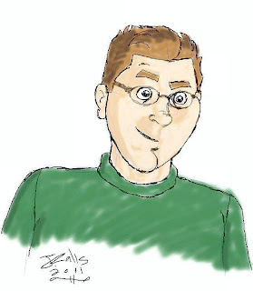
Working with Layers (Self Portrait)
Image
When doing digital drawings, whether partly or entirely digital, I usually don't use layers. Layers are where you separate different parts of the drawing into layers. Like for example, guide lines would be one layer. Details, such as the eyes, nose, etc., would be another layer. Colors would be another layer. I usually do everything on the canvas and don't use layers. However, I thought I'd try layers tonight. I didn't get very thorough with this drawing because it was basically just an excuse to experiment with layers. I forgot to delete the guidelines layer before I grouped it, but I don't think it shows up much. I adjusted the layers so the details show through pretty well. I'll want to practice more with layers so I really get the hang of it. So far I think I'm getting somewhere with them though.

Matt Kirby

Image
This is my second character for my blog comic strip. Matt Kirby has been a friend of Jack Miller's since high school. Matt is in a rock band. He's got kind of a gruff personality, but he's a good guy. Jack and Matt are the two characters I've drawn so far. I'll have to figure out which one to illustrate next, and at some point I'll post them. Then I'll illustrate the next one, and post them, and so on.

Jack Miller

Image
This is the main character of my comic strip I'm working on for my blog. Jack Miller is a graphic artist. He's kind of a geek, and he's into comic books, video games, etc. The way I imagine this character, I think he could become good friends with Jon Arbuckle of Garfield . I scanned and colored this character last night. I added the box with the green halftone in it in photoshop. The next character I blog will probably be his friend Matt Kirby. I've already drawn him. However, all I've done with it on the computer is that I scanned it.

The Blue Wombat

Image
If you saw The Green Hornet movie you might remember The Green Hornet suggesting to Kato that he go by the name "The Blue Wombat." I thought about what it might be like if there were a superhero with that name, and the above picture is what I came up with. I went for the classic pop art style for this picture. I think I really need to use the "threshold" feature in my paintshop program more often when I'm digitally coloring scanned drawings. If I don't, it tends to get rough around the lines. It did with this one and I tweaked the picture quality.

The Stan Lee Foundation Contest/ Lelia Broussard on the Cover of Rolling Stone

Voting for The Stan Lee Foundation contest is now closed. The winners will be announced March 3. I'm thinking now about whether to blog my superhero soon, or wait until the winners are announced. I saw that one person had votes in the hundreds. Based on that, I might end up being a runner up at best, which I think would be cool too. If I don't win at all, at least I tried. Also, I got about 31 people showing that they liked and supported my superhero. I don't know if they go just by votes or if they also have judges judge the superheroes. Whatever the case, we'll see whether I win anything on March 3. While I'm at it typing up this entry, I'd like to mention that musician Lelia Broussard is one of some number of musicians being considered to be on the cover of a future issue of the Rolling Stone magazine. I have a thing above this area for voting for Lelia. She is a very talented musician and I would really appreciate it, and she especially would, if you would p

Eliza's Feet

Image
I drew this picture of Eliza Dushku's feet in 2009. I saw a picture of her feet on, I think Eliza-Dushku.org. I usually draw her face or something like that, but this time I just felt like drawing her feet, so I did. I think it turned out pretty well. Eliza Dushku is beautiful from head to toe, foot pun intended.

Green Lantern Ring (Pencil)

Image
I figured it was about time to blog another drawing, and I started on this one this week. This is just the pencil stage. I'm planning on digitally coloring it. I'll put in some kind of background. Usually the "x" is for black areas when comic book artists are drawing the art. I'm thinking of coloring the "x" areas on this drawing dark green. Once I get it all done I'll blog it on here.

The Stan Lee Foundation Contest

I've entered in The Stan Lee Foundation contest on the Talenthouse site. It's for people to submit their superhero creations and have people vote on them. The entry part is over, and the voting period began today. You can vote for my superhero, The Golden Avenger, here . People including myself have been having trouble with the site today. When I would go to it, it would show an error page. If you have that problem, you'll have to click the refresh button on your browser. I would show my entry on here now, but I'm not sure if it would disqualify me. However, once the contest is over I'll publish my entry on here. You do get to see it on the Talenthouse site though. As far as I can tell, it only shows it one size. Once I post it on here though, after the contest is over, I might post a larger size picture of it. Last I checked I had four votes, including myself. So, please check it out and vote for my superhero.

Skottie Young

In one of my previous blogs I mentioned Skottie Young. He's a professional graphic artist who works in the comic book industry. He's got a great style that's cartoony, and it's got an edge to it. I love how he draws characters like Spider-man. I think there's something about the way he draws characters with full masks, and how he gets so much expression out of a character whose face you can't see. I have his blog, SkottieYoung.com, in my links off to the right if you'd like to check it out. I recommend it.

Scott Pilgrim Vol. 2 and Daredevil Vol. 3

I'm reading Scott Pilgrim Vs. The World , the second volume in the Scott Pilgrim graphic novel series, for the second time. There seems to be quite a bit that you don't see in the movie. These books are really fun to read. I read the first one twice in one week I think. I think it was the week after I got it for Christmas. I started it Christmas day and before the next week was over I'd read it two times in a row. I read this second one twice, but not in a row. I would have, but I got Daredevil Vol. 3 , which is also a great book, and held off on the second read of volume two of Scott Pilgrim. Daredevil Vol. 3 is written by Brian Michael Bendis with art by Alex Maleev, Manuel Gutierrez and Terry and Rachel Dodson. To me it seems like Law & Order with a superhero. The writing is great. All the artists did awesome work. I'd never seen Manuel's art before and it's very cool. Terry and Rachel Dodson are a great team. Alex Maleev's gritty style was very fitt

Captain America

Image
With the Captain America: The First Avenger movie poster debuting today, I thought this would be a good opportunity to post my "Captain America" drawing. I used a picture of Bruce Willis as a photo reference. It helped that it was from the bald Bruce era. The reference was an image for the fourth Die Hard movie. I think Chris Evans is going to be a great Cap, and I think the movie will be great.

Jesus Christ

Image
I drew this on sketchbook paper, then I scanned it and photoshopped it. I wanted it to look like it was drawn on rice paper. I used a sunlight effect to show Jesus with an aura of light. I think this drawing turned out really well.